The easiest way to visually review information that shows gains or losses over time is to use a waterfall chart. You can create a waterfall chart in Microsoft Excel using the built-in chart tools, but you can also create your own using a custom stacked bar chart.
To create a waterfall chart in Excel, follow the steps below.
What Is a Waterfall Chart?
A waterfall chart is a chart that shows the progression of a value over time or through sequential stages. Put more simply, a waterfall chart shows how things add up or subtract over time, allowing you to see the gains or losses you’re making.
Each bar in the chart represents a separate element that positively or negatively influences the final total. By showing this data, it’s easier to track how individual components contribute to an overall total.
The chart begins with an initial value, which is then adjusted by a series of intermediate values that either increase or decrease, leading to a final result. You’ll find a waterfall chart useful for analyzing financial data, such as monthly cash flows or inventory levels.
A waterfall chart will include the initial and final values, represented by whole bars that bookend the intermediate values. They also include intermediate steps, with colored bars that reflect incremental changes, where gains are shown in one color (typically green) and losses in another (typically red).
There are also connecting lines, which sometimes appear between bars to help visually link the sequential changes. Its distinctive look, resembling a cascade, comes from the floating bars that seem to fall or rise from the stability of the baseline, hence the name—a waterfall.
How to Create a Waterfall Chart in Microsoft Excel
You can use a waterfall chart in Microsoft Excel to analyze sales over time, check your net profit (or loss), compare product earnings, or look at budget changes.
To craft a waterfall chart that reveals the cumulative impact of these values on an initial starting point, follow these steps. These steps will work for Excel users on Windows or Mac.
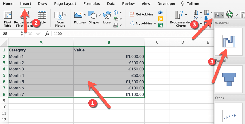
- Begin with your data properly arranged in Excel, starting with an initial amount, followed by any subsequent values, and ending with the final amount.
- Select the range of cells that include your data points.
- Press the Insert tab, then press either the Waterfall button (on Mac) or Insert Waterfall or Stock chart button (on Windows).
- Choose Waterfall from the drop-down menu to generate your initial chart.
How to Edit a Waterfall Chart in Microsoft Excel
After creating your chart, it’s time to fine-tune it for clarity. Excel automatically assigns the starting and ending totals as whole bars, while the intermediate values appear as floating columns that rise or fall from the preceding subtotal.
By customizing your chart colors and adding data labels, you’ll make your data easier to understand. Remember to periodically save your work to avoid losing any changes.
To change the formatting of your waterfall chart, follow these steps.
- Click on your chart to select it—that’ll bring up the Chart Tools on the ribbon, showing the Design and Format tabs. On a Mac, that’ll be labeled as Chart Design and Format.
- Use the Design tab to modify the chart style.
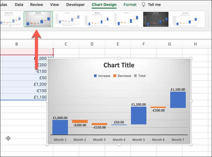
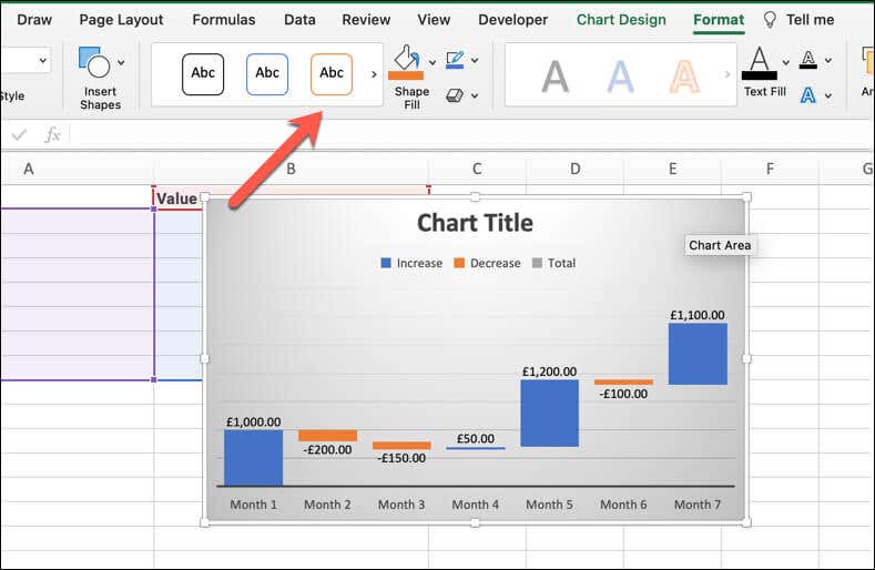
- In the Format tab, adjust the bar shapes, styles, and colors of your chart. You can also alter text fonts and add shape effects.
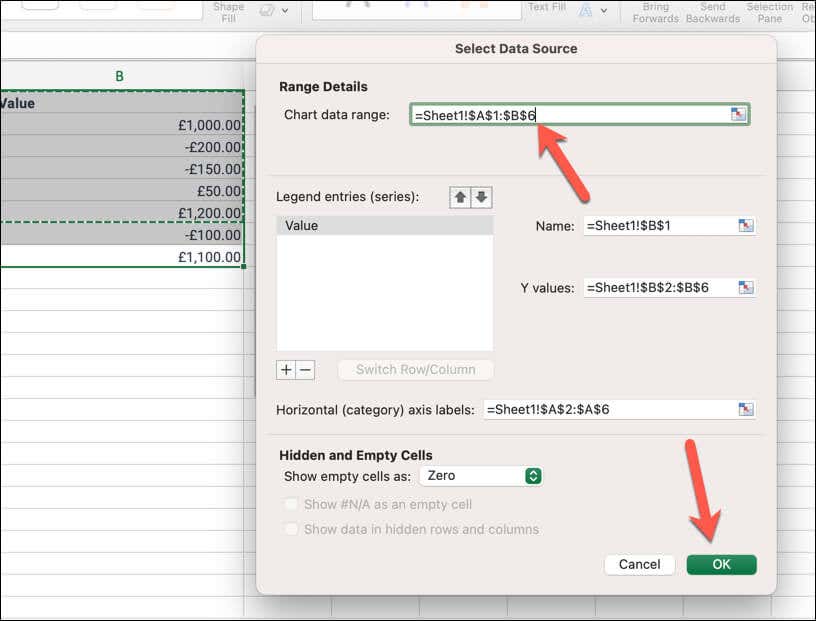
- To edit the data in your waterfall chart, right-click your chart and select Select Data… to bring up the Select Data Source dialog.
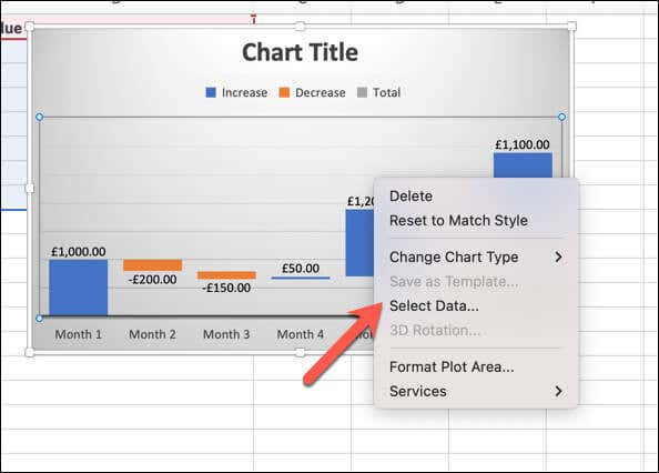
- You can change the data range for your chart or edit the individual data points. To adjust individual columns, click on them directly and right-click to access formatting options.
How to Build a Custom Waterfall Chart Using a Stacked Bar Chart
While it’s more effort, you can create a custom waterfall chart using a stacked bar chart to reflect the incremental changes in data instead. To build a custom waterfall chart using a stacked bar chart, follow these steps.
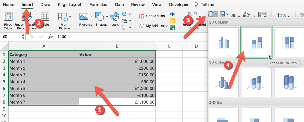
- Open a blank Excel worksheet and input your data with initial and final values along with the incremental changes.
- Highlight your data range and insert a stacked bar chart from the Insert tab by pressing Column, then selecting the Stacked option.
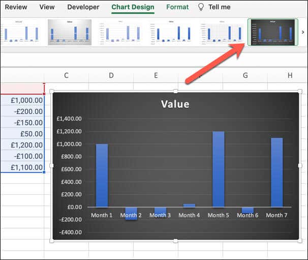
- Make changes to the chart using the Chart Design and Format tabs. For instance, you can change the chart title, make changes to the bar formatting, and more.
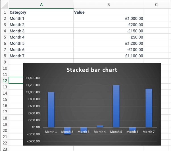
- When you’re finished, click off the chart to view the finished result.
Visualizing Your Data in Microsoft Excel
By creating a waterfall chart in Excel, you’re able to visualize the ups and downs in your data. It’s perfect for a sales report, but don’t be afraid to try other charts if it isn’t giving you the clarity you need—or if it isn’t suitable for the data you’re reviewing.
For instance, if you’re trying to track time in an important project, you can use a Gantt chart in Excel to help you do it.
The post How to Create a Waterfall Chart in Microsoft Excel first appeared on Help Desk Geek.
